Meaning of the color blue
Meaning of blue color: trust, stability, serenity, freshness. In branding and decor, blue brings calm and depth. The meaning of blue colors varies according to the shade:
- Light blue / sky blue: lightness, openness, soothing.
- Pastel blue: softness, minimalism, muted universe.
- Royal blue: confidence, dynamism, modernity.
- Marine blue / night blue: elegance, seriousness, sophistication.
- Turquoise blue / green blue: energy, freshness, aquatic spirit.
- Petroleum blue / gray blue: refinement, contemporary note.
- Indigo blue / cobalt blue: intensity, creativity.
- Electric blue: strong visual impact, technology, modernity.
Myth to debunk — « Blue is a warm color » / « blue is a warm color »: in color theory, blue is classified among the cool colors. However, it can appear more “warm” if it leans towards purple (adding a hint of red) or is associated with warm materials (wood, brass).
Palette of the most sought-after blues
The codes below are provided for reference (the blue color codes may vary according to publisher references).
| Shade | Name (FR) | Hex (example) | Usage type |
|---|---|---|---|
| royal blue | royal blue color | #4169E1 | UI, dynamic logo |
| Navy blue | marine blue color | #000080 | Chic decor, premium identity |
| Midnight blue | night blue color | #191970 | Muted atmospheres |
| Duck blue | duck blue color | #0E7C7B | Contemporary decor |
| Petrol blue | petrol blue color | #204E5F | Accent wall, textile |
| Turquoise blue | turquoise blue color | #40E0D0 | Aquatic notes |
| Azure blue | azure blue color | #007FFF | Bright graphics |
| Sky blue | sky blue color | #87CEEB | Soft ambiance |
| Light blue | light blue color | #ADD8E6 | Calming neutral background |
| Pastel blue | pastel blue color | #AFCBE3 | Minimal universe |
| Indigo blue | indigo blue color | #4B0082 | Deep accent |
| Cobalt blue | cobalt blue color | #0047AB | Strong contrast |
| Electric blue | electric blue color | #7DF9FF | High-tech, signage |
| Blue gray | blue-gray / gray-blue color | #6B8BA4 | Nordic style |
| Blue green | blue-green color | #0D98BA | Navy palette |
To quickly find a precise blue color code, start from the desired rendering (pastel, light, dark, navy, petroleum) and then adjust saturation and brightness.
Complementary color of blue and harmonies
The complementary color of blue (on the RGB color wheel) is orange. It’s a useful rule for creating strong contrasts in decor and design.
- Complementary : blue + orange (impact, signage, accents).
- Analogous : blue, blue-green, turquoise (harmonious gradients).
- Triad : blue, red, yellow (vivid graphic games).
- Neutrals : blue + white, gray, beige, wood (timeless elegance).
Blue and associations in decoration
Ideas to answer « what color goes with blue » and « navy blue with what color » :
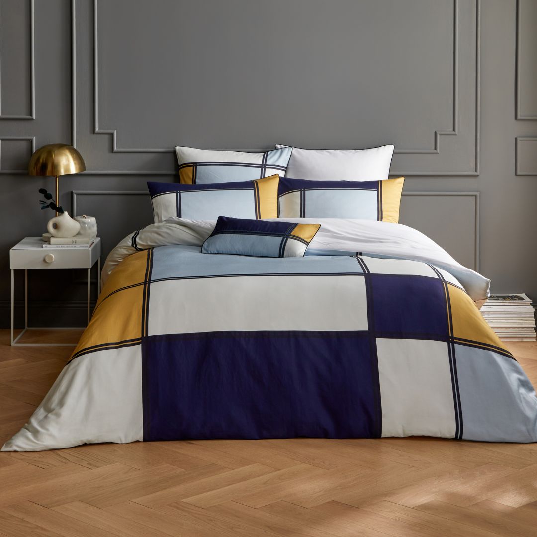
- Navy blue + white : classic chic (living room, entrance).
- Midnight blue + brass : premium and warm (sconces, handles).
- Petroleum blue + light wood : Scandinavian and contemporary.
- Duck blue + beige: cozy, balanced.
- Royal blue + light gray: graphic, modern.
- Turquoise blue + sand: seaside.
- Pastel blue + natural linen: soft and bright.
- Blue + terracotta: very current mineral contrast.
Mixes with blue: what does the color combination yield?
| Question | Answer (approx.) | Notes |
|---|---|---|
| What color do blue and red make? / What color do red and blue make? ? | Purple / violet | Depends on the primary colors used (magenta/red + blue/cyan). |
| What color do blue and yellow make? ? | Green | The brighter the yellow, the more vibrant the green. |
| What color do blue and green make? / What color do green and blue make? ? | Turquoise / cyan | Dosage = from blue-green to green-blue. |
| Blue and orange (complementary) | Strong contrast | Ideal for highlighting an element. |
How to make blue with two colors? In traditional painting (RYB), blue is primary: you cannot create pure blue by mixing other pigments. In modern subtractive synthesis (CMY), cyan + magenta can produce blues that are more or less deep.
Express FAQ
Is blue a warm color?
No, blue is classified among cool colors. It can appear warmer if mixed with a hint of red (violet blue) or paired with warm materials.
Complementary color to blue?
The orange. Use it for a vibrant contrast in displays, signage, or accent elements.
What color goes with navy blue?
White, beige, light oak, brass, pearl gray, soft terracotta. For a nautical style: white stripes + navy blue.
Difference between petroleum blue, teal blue, and turquoise blue?
Petroleum blue: deep blue leaning towards gray-green. Teal blue: dark and saturated blue-green. Turquoise blue: lighter, more “aquatic.”
Blue color codes (examples) for the web?
Royal Blue #4169E1, Navy #000080, Night #191970, Teal #0E7C7B, Petroleum #204E5F, Turquoise #40E0D0, Azure #007FFF, Sky #87CEEB, Pastel #AFCBE3, Indigo #4B0082, Cobalt #0047AB, Electric #7DF9FF, Blue Gray #6B8BA4, Blue Green #0D98BA.
Quick checklist for decor use
- Define the desired ambiance: light blue (soothing) vs dark blue (intimate, chic).
- Choose 1 to 2 blues + 2 neutrals (white, blue gray, beige) for a cohesive palette.
- Reserve intense blues (navy, night, petroleum) for accent walls or bright rooms.
- Pair blue with its complementary (orange/terracotta) in small touches (cushions, posters, lighting).
- Adjust saturation: pastel blue to visually enlarge, royal blue to energize.