Introduction to camel color
The camel color represents one of the most elegant and timeless shades in the color spectrum. This sophisticated hue takes its name from the coat of the camel and immediately evokes the warmth of the desert and the authenticity of natural materials.
The camel color stands out for its exceptional versatility in the world of interior decoration and fashion. This warm neutral shade offers a refined alternative to traditional beiges while maintaining a certain visual depth.
Understanding the nuances of camel color
| Name of the variant | Hex Code | Overview |
|---|---|---|
| Classic camel | #C19A6B | |
| Camel clear | #D2B48C | |
| Dark camel | #8B6C42 | |
| Sand camel | #C2B280 | |
| Golden camel | #B08D57 | |
| Beige camel | #E3C6A4 | |
| Brown camel | #A07855 | |
| Warm camel | #CD9575 |
The brown camel: a deep variant
The brown camel color constitutes a more intense variation of the original shade. This variation incorporates brown undertones that intensify the chromatic richness of the whole. The camel brown finds its place in interiors where a cozy and enveloping atmosphere is sought.
This particular shade expresses itself perfectly in camel leather, a noble material par excellence. Leather in this hue brings an unparalleled tactile and visual dimension to any arrangement.
Dark camel: intensity and character
The dark camel color represents the most dramatic expression of this chromatic family. This saturated variant is particularly suitable for contemporary spaces where marked contrasts are desired.
Dark camel harmoniously opposes beige camel, creating subtle yet perceptible nuances. This opposition allows for visual structuring of a space without resorting to bold colors.
Harmonious associations with camel color
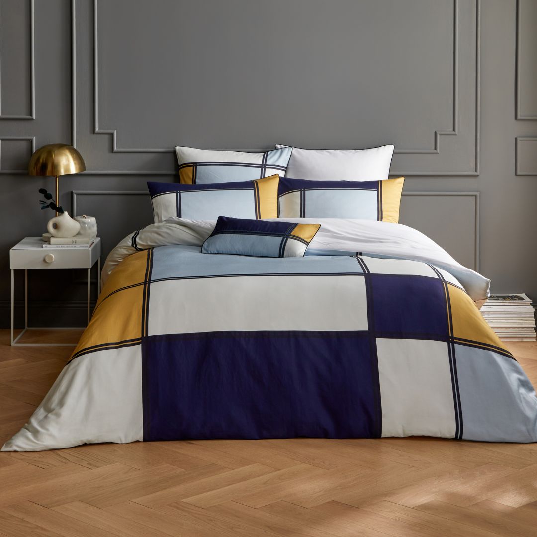
Camel and navy blue: a classic duo
The association of camel and navy blue forms one of the most successful chromatic marriages in contemporary decoration. This combination of camel color and navy blue evokes maritime elegance while maintaining earthly sophistication.
The contrast between the warmth of camel and the coolness of navy blue creates a perfect visual balance. This alliance works well in both classic and modern interiors.
Camel and gray: modern sobriety
The duo of camel and gray embodies clean modernity. This association allows for the creation of soothing atmospheres where camel brings the necessary warmth to the natural coolness of gray.
This combination adapts particularly well to workspaces and bedrooms where serenity and concentration are sought.
Other remarkable color associations
Camel and red: controlled passion
The association of camel color and red requires a measured approach. Red, an intense color by nature, finds in camel a partner that tempers its ardor while enhancing its presence.
Camel and green: natural harmony
The marriage of camel color and green immediately evokes nature and desert landscapes. This camel color association with olive or sage greens creates organic and relaxing atmospheres.
Camel and orange: amplified warmth
The combination camel orange color or camel brown color enriched with orange creates particularly warm atmospheres. These related shades enhance each other without creating visual discord.
Cognac and camel: muted luxury
The alliance of cognac and camel colors represents the pinnacle of chromatic refinement. These two shades, from the same family, create color gradations of exceptional richness.
Practical guide for matching camel color
Fundamental principles for matching camel color
Matching camel color requires an understanding of its thermal nature. Camel belongs to warm colors, which greatly influences its potential associations.
To effectively match camel color, it is essential to first identify the desired effect: contrast or harmony. This approach will determine the choice of complementary colors.
The beige camel color: maximum subtlety
The beige camel color represents the softest version of this shade. This particularly subtle hue allows for bold associations while maintaining a reassuring neutral base.
Determining whether camel is a warm or cool color
The question camel warm or cool color finds its answer in the analysis of its components. Camel undeniably belongs to warm colors due to its yellow and orange undertones.
This thermal characteristic directly influences the most harmonious colors matched with camel.
Practical applications in painting and decoration
Camel color paint: techniques and tips
Using a camel color paint in an interior requires prior reflection on the room's light exposure. This shade reveals all its beauty under generous natural lighting.
The camel paint color is ideally applied to a single wall to create a focal point without weighing down the space. This technique highlights camel colors without risking visual saturation.
Camel color code: technical references
The camel color code varies according to the reference systems used. Generally, this shade falls between the codes #C19A6B and #A0805C depending on the desired intensity.
These technical references facilitate coordination between different decorative elements and ensure perfect chromatic harmony.
Colors with camel: association rules
Identifying the colors with camel that are most flattering requires considering the entire space. Camel particularly values off-whites, creams, and ecrus.
These neutral associations allow camel to fully express its personality without chromatic competition.
Current trends and decor inspirations
Camel in contemporary trends
The camel color association is experiencing a resurgence of interest in current decorative trends. This revival is explained by the search for authenticity and naturalness in our interiors.
Camel perfectly responds to this aspiration by offering sophistication and simplicity in the same chromatic momentum.
Inspiration for different spaces
Living room and living spaces
In a living room, camel creates a welcoming atmosphere conducive to relaxation. Paired with natural textiles, it transforms the space into a refined cocoon.
Bedroom
In a bedroom, camel promotes calm while maintaining a certain reassuring warmth. This color facilitates falling asleep due to its non-stimulating nature.
Workspaces
In an office, camel inspires confidence and serenity. This shade promotes concentration without creating visual fatigue.
Expert tips for successful associations
Balancing the proportions
The art of camel color association lies in the balance of proportions. A dominant camel requires touches of brighter colors to avoid monotony.
Playing with textures
Camel reveals all its richness when expressed in different textures. Leather, velvet, linen: each material brings its own interpretation of this timeless shade.
Considering the lighting
Lighting significantly influences the perception of camel. Warm lighting intensifies its golden undertones, while cool lighting can dull it.
Mastering the art of camel in decoration
The camel color represents much more than just a simple neutral shade. It embodies timeless elegance and natural sophistication. Its ability to adapt to all decorative styles makes it a safe choice for those seeking refinement and aesthetic durability.
Mastering your associations allows you to create interiors with exceptional chromatic richness, where every shade finds its place in perfect harmony. The camel awaits your creativity to reveal all its splendor in your living space.